BEES - Projects
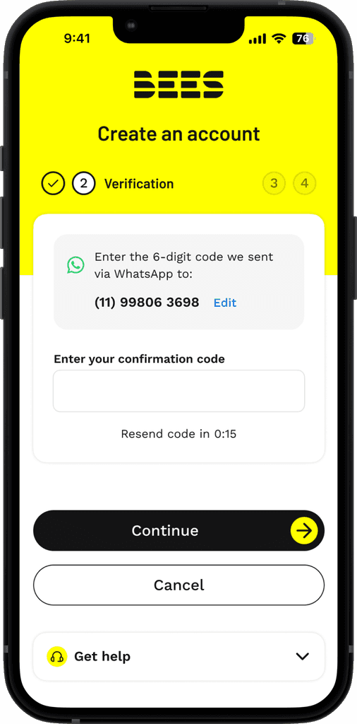
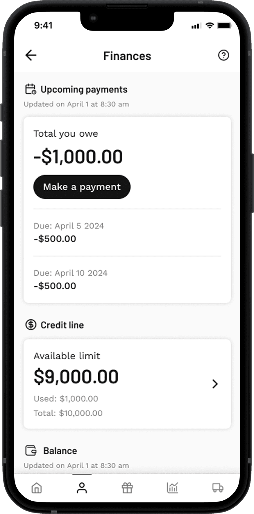
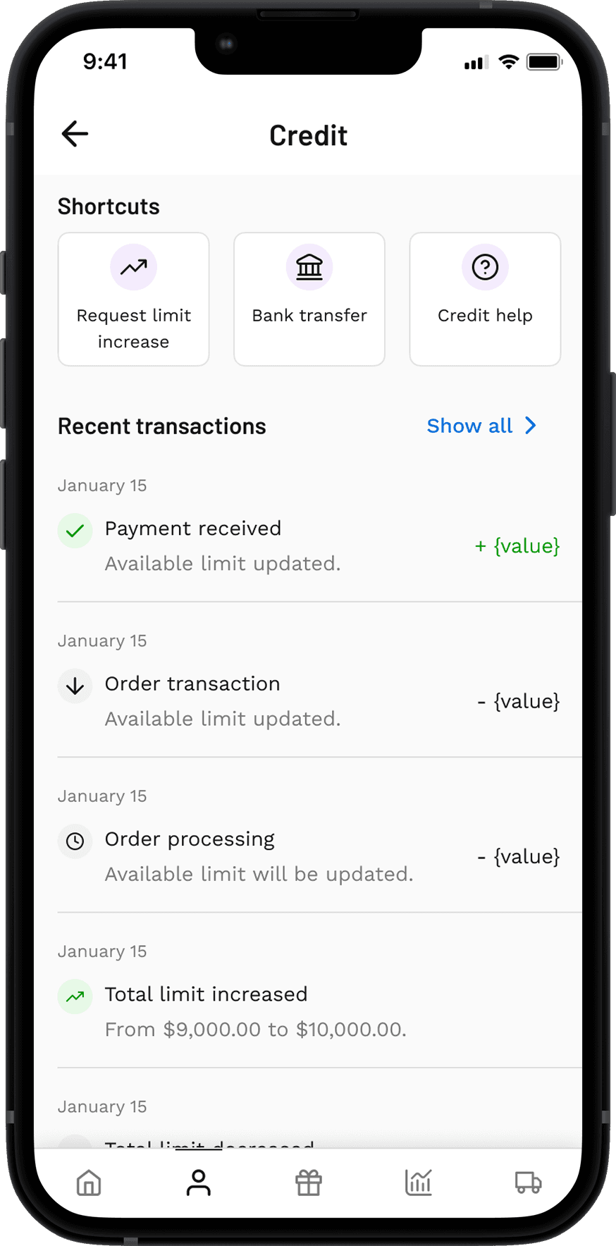
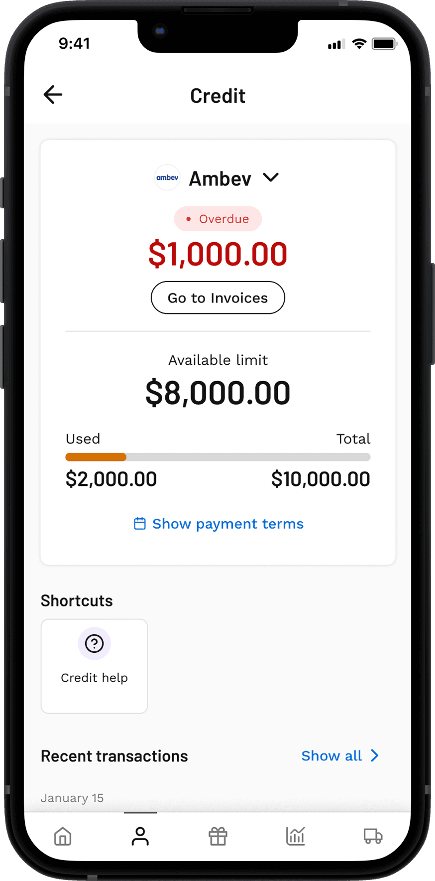
Credit - Digital onboarding
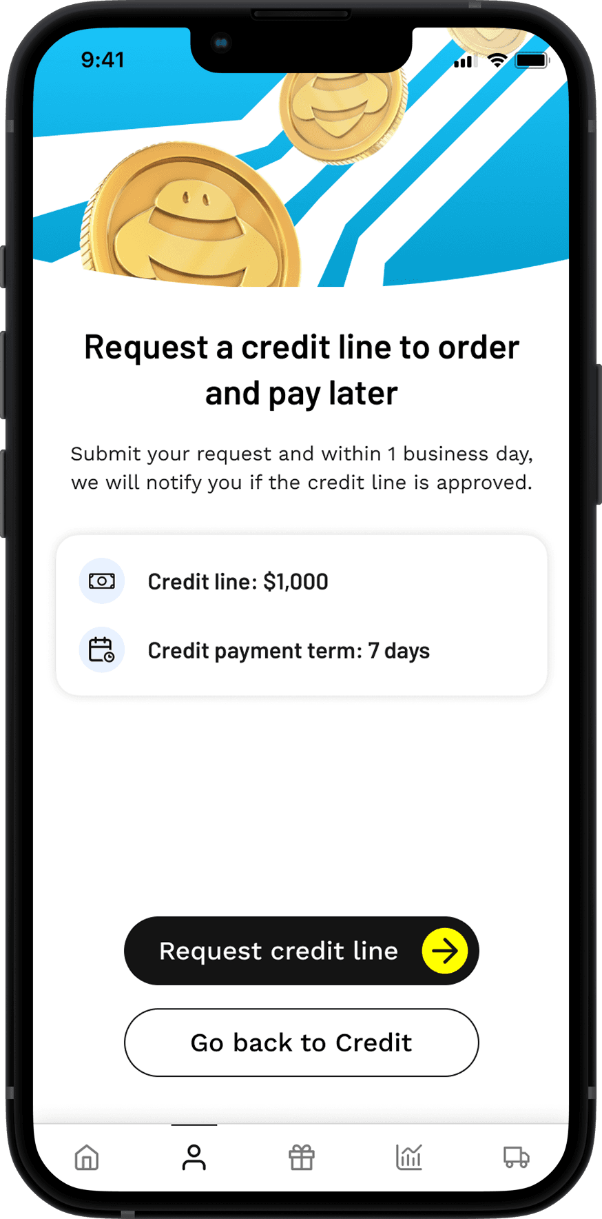
Credit Onboarding is a feature designed to streamline user enrollment for credit and accelerate the expansion of our credit solutions to new markets.

Modular experience
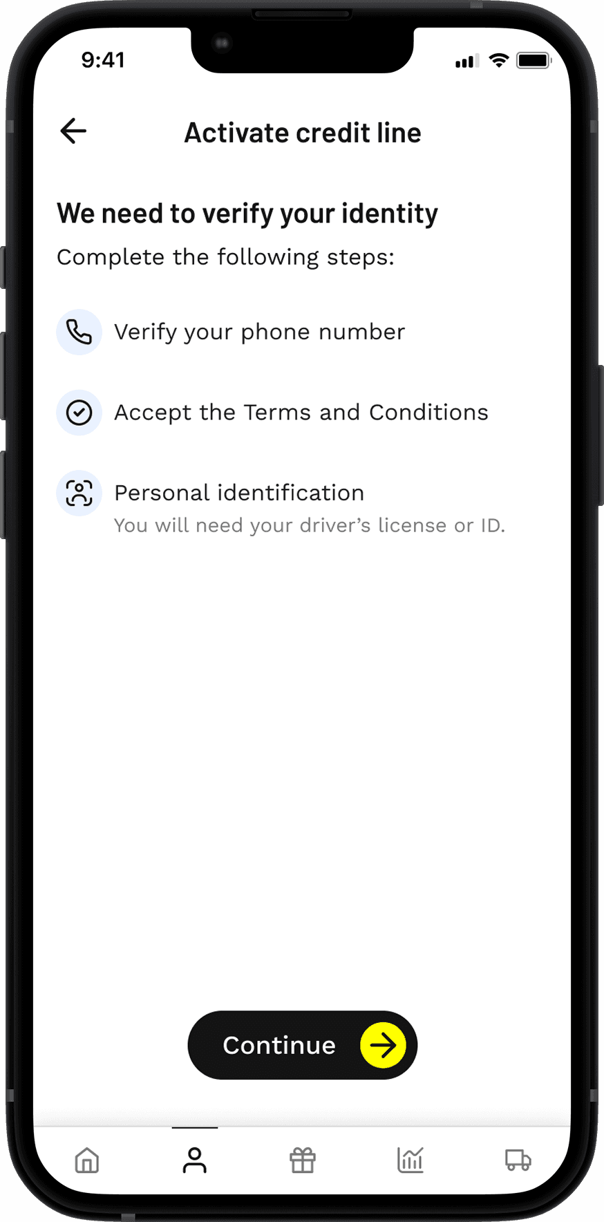
We designed the onboarding with a modular approach, allowing us to quickly adapt to the unique legal, regulatory, and business requirements of each country. Working closely with engineering and the commercial team, we created a flexible framework to easily add or change screens and flows for every market.
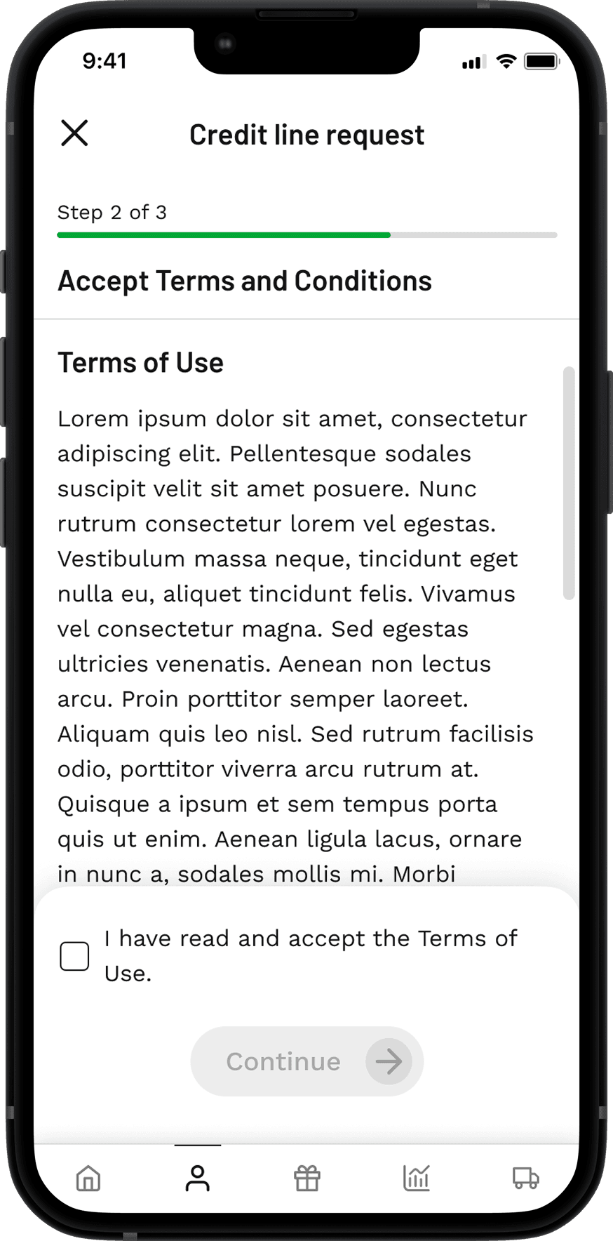
For example, in Colombia, we integrated a legal compliance module requiring users to accept specific terms and conditions. In Brazil, users were required to validate both their CNH (driver’s license) and RG (national ID) to confirm their identity as part of the onboarding process. This modularity enabled us to scale faster and deliver tailored experiences without rebuilding from scratch for each market.
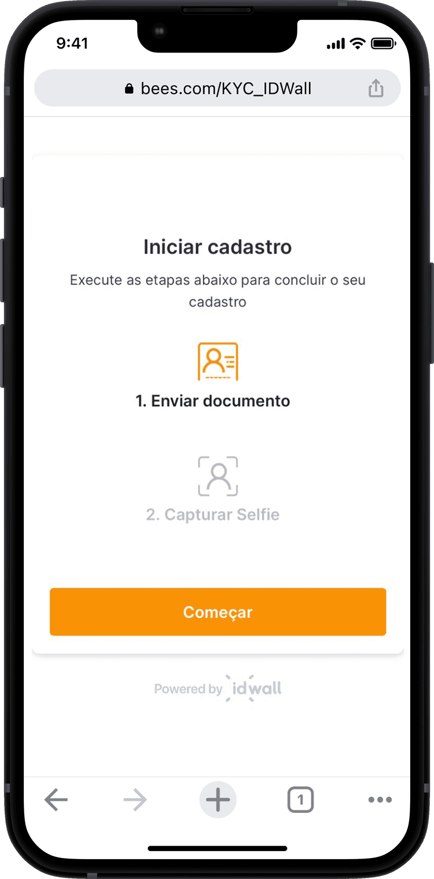
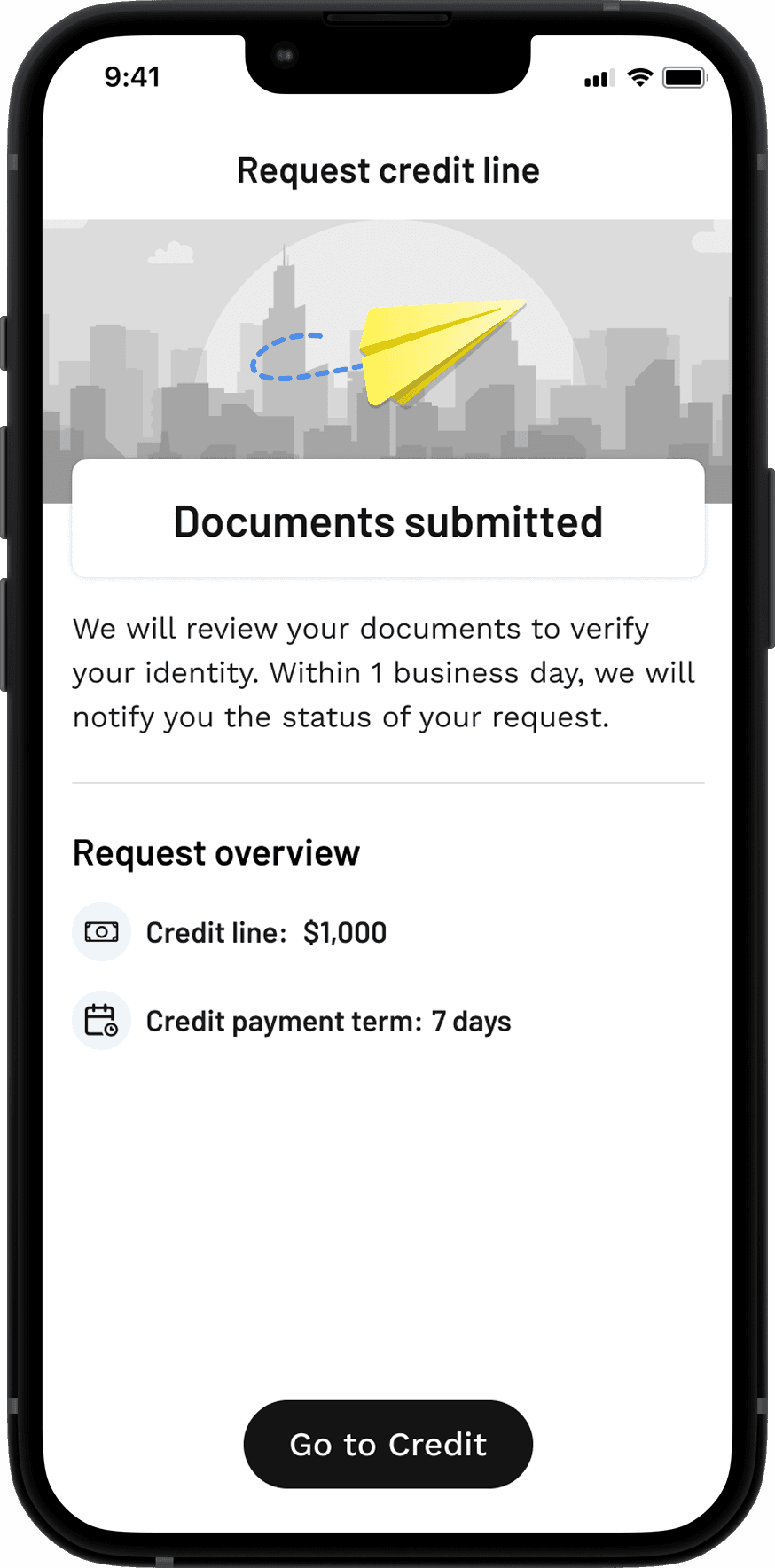
User flow
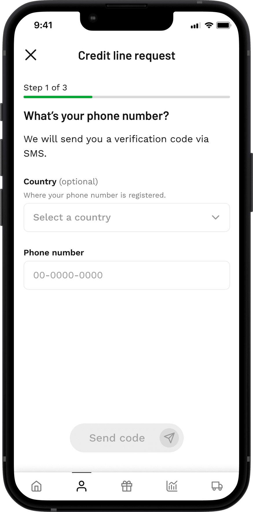
Below you can see the step-by-step user flow for Brazil, where users are guided through a secure identity verification process via browser before returning to the BEES app to complete onboarding.
Results
Automated Expansion
We made the BEES credit onboarding module scalable, eliminating the need to develop separate solutions for each country. As a result, market expansion became much faster and more efficient.
Modular onboarding
Our modular approach enabled us to efficiently adapt onboarding flows for different markets, greatly reducing time-to-market and increasing our capacity to scale.
100% Digital Credit Offering
Credit became fully accessible through the app, removing the dependency on in-person campaigns and sales teams. This allowed us to instantly reach 100% of our user base, driving adoption and increasing engagement.
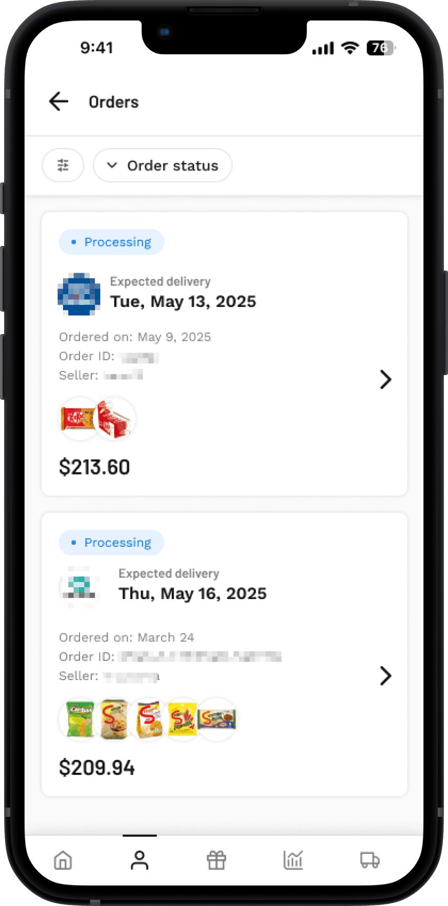
Orders redesign
This is the redesign of the Orders page and the Order Details page. The goal was to align the interface with the current Design System and to add the necessary features for a clearer, more intuitive user experience.
Review all order statuses
The main challenge of this feature was to review and redesign all order status flows in close collaboration with logistics, development, and real-world user feedback. Many of the existing order statuses were outdated or failed to communicate the right message at the right time, often leading to confusion for both users and internal teams.
Working closely with the UX Writing team, we systematically evaluated each status and developed a consistent standard—defining clear labels, color codes, and messaging for every scenario. This approach ensured alignment between product, operations, and user experience, improving both internal processes and customer satisfaction.
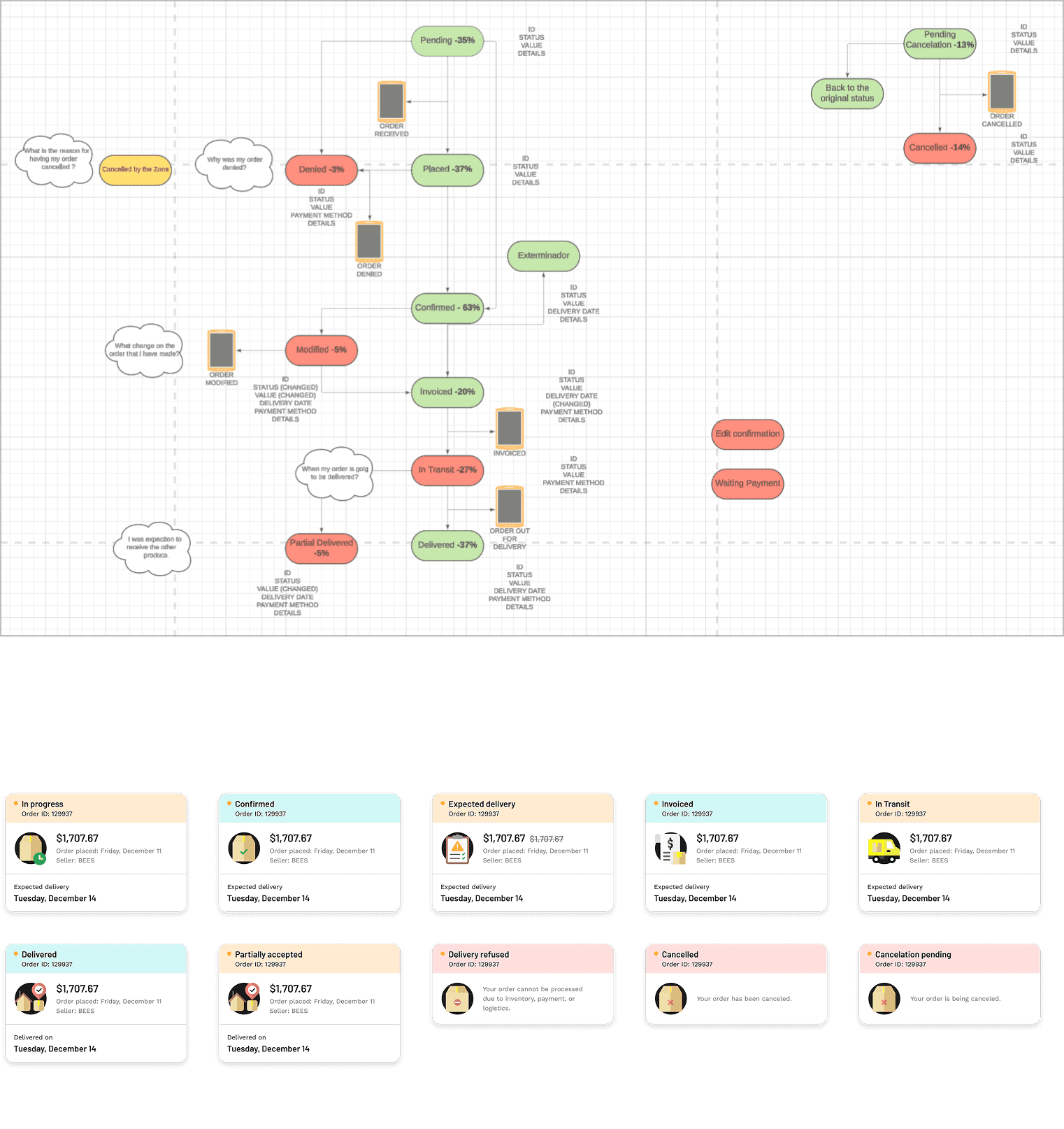
Mapping and reviews all statuses.
Orders list: Before
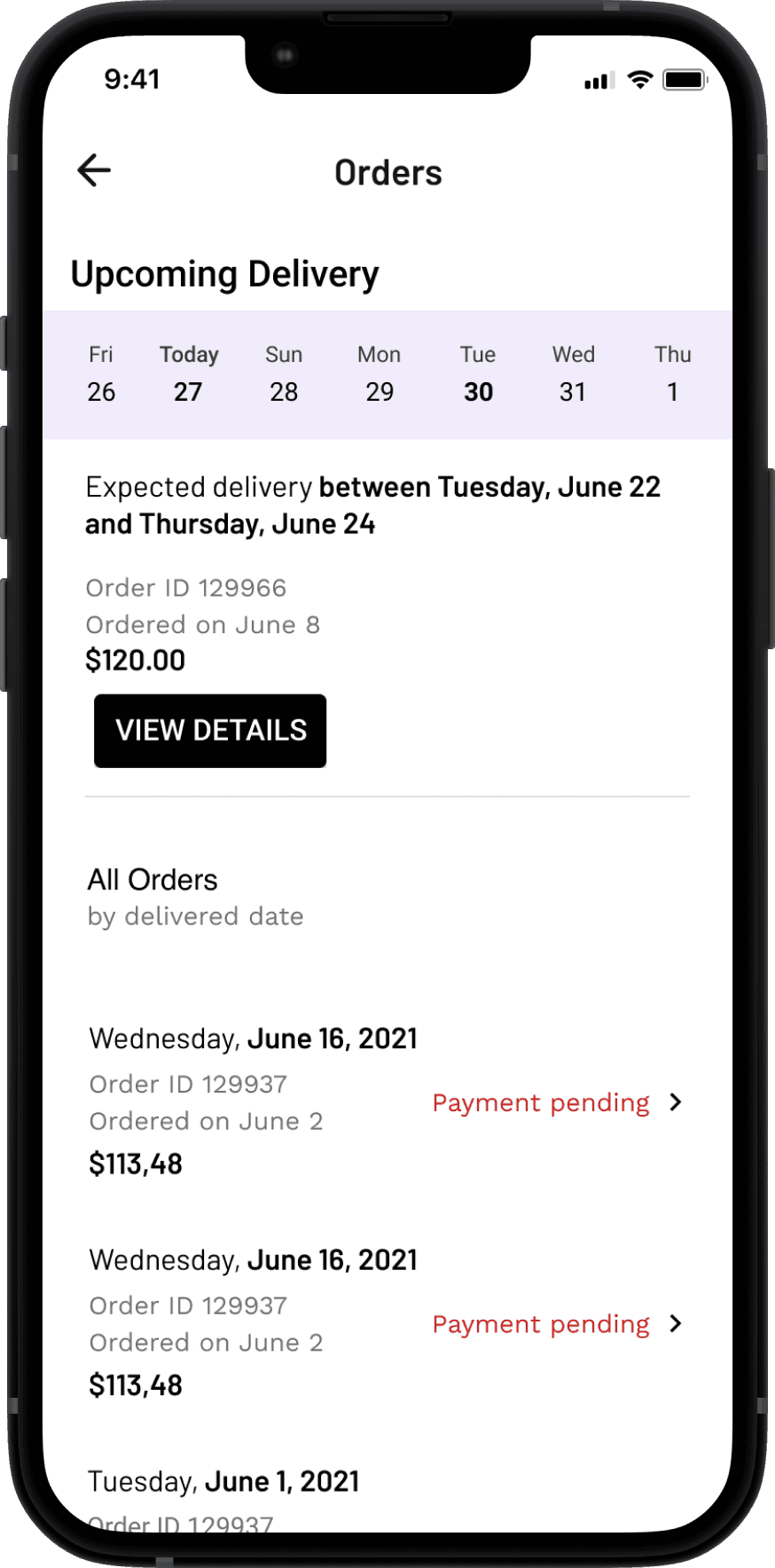
Orders list: After
Status: Before
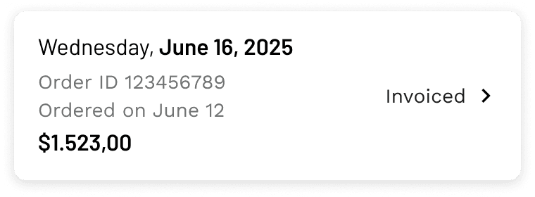
Status: After

Results
Increased engagement on Order page
We observed a significant rise in user visits and time spent on the order page, showing that users find it easier and more valuable to track and manage their orders within the app.
Reduced support tickets
Clearer order status updates resulted in fewer support tickets related to order tracking. Users now understand their order progress without extra help, improving satisfaction and operational efficiency.
Design System consistency
The project reinforced alignment with the company’s design system and language, ensuring a more cohesive experience across the app, and supporting scalable future development.
More projects
Thank you